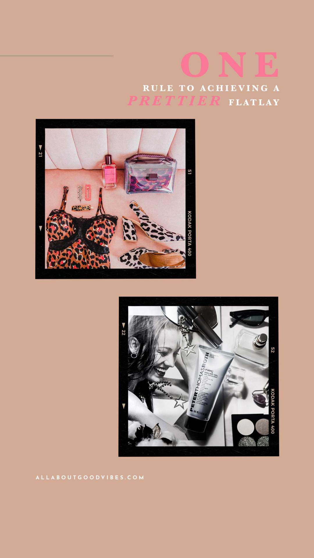
Sharing with you today, the one rule I use all the time when it comes to taking flat lay photos. I call it “The Rule of Similarity”.
It’s a super easy rule that works like a charm every time. Enjoy the read and let me know your thoughts in the comments!


My favorite rule I use to achieve a prettier flat lay is “The Rule of Similarity”.
No, this is not a geometric rule about the two geometrical objects that both have the same shape, or one has the same shape as the mirror image of the other. But this is the rule I invented for my flat lay photography. It’s Molly’s Rule! Lol! ? But I’m happy to share how I use this rule with you today. Pretty much this Rule is to pick similar main objects and props to use in your photo.
This is the one rule I use all the time when it comes to taking flat lay photos. Either the similar pattern of objects, the similar colors, color schemes that create an aesthetic feeling to the photo, similar shape, feel, and many more. Nothing too complicated. If they look similar, that’s all that matters. For me personally, I’d normally pick and play with similar colors and similar patterns in my photoshoot session.


The Rule of Similarity

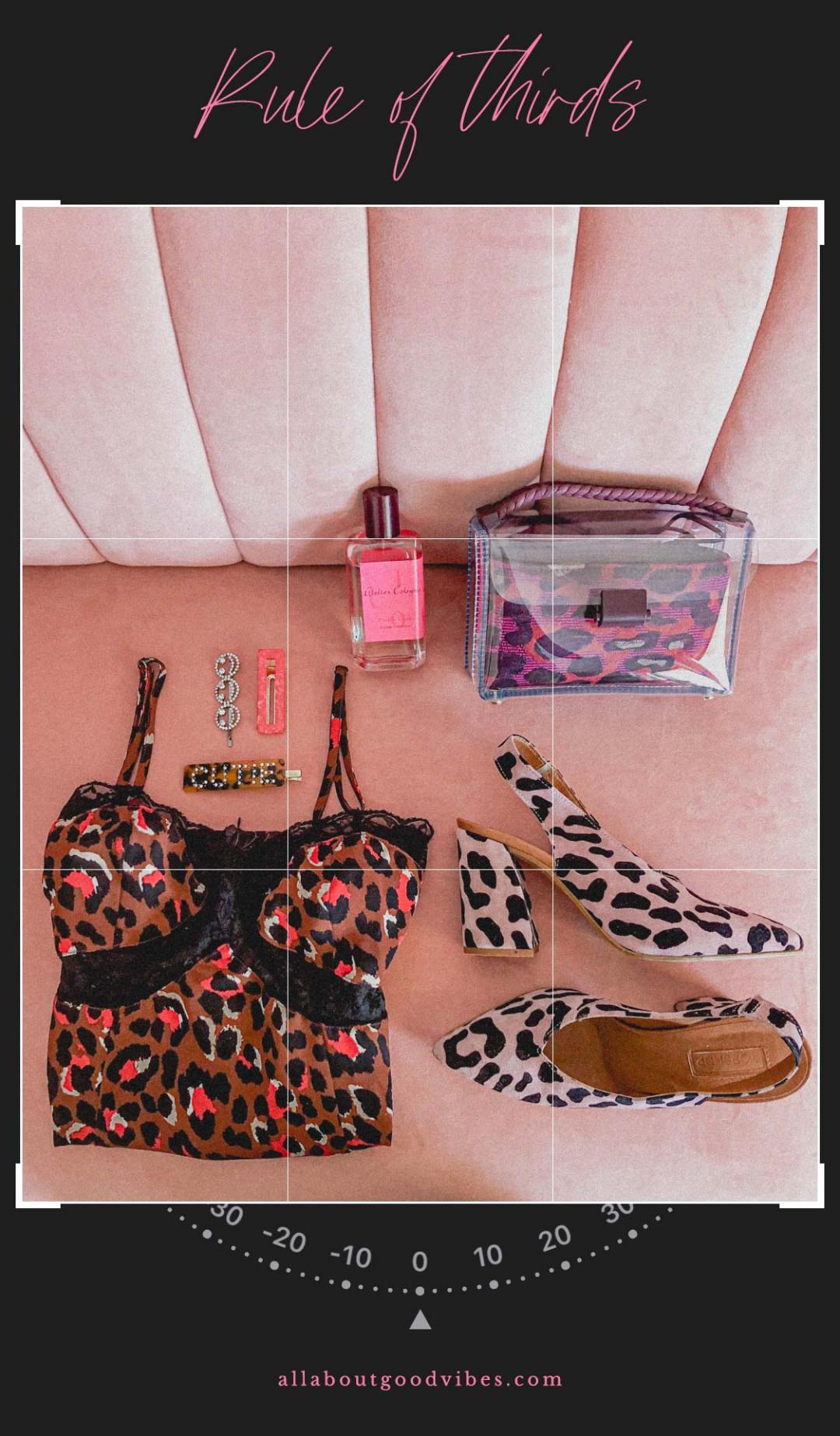
For example, this flat lay photo above, I took on my couch, using my iPhone to take it as the iPhone comes in handy with the camera grid tool that helps guide with spaces and straightening of the photo. As well as it’s very easy to use and control when working in a small space.
As for my photoshoot steps, I follow my flat lay planning process, (you can download it here), got the couch as my background, and picked pink and red as my main colors. The purpose of this flat lay is to share my current favorite items, bag, cami dress, slingback heels, hair clips, summer perfume, and my new couch.
I didn’t have a single main product I wanted to highlight so I gave all of them equal attention but still applied the rule of thirds to this photo, where my bigger objects are at the bottom of the photo.
As you can see that the majority of items in this photo are pink & red and are leopard prints. These are the rules of similarity I applied here.
The last step before the finished photo, I edited it with my Lightroom preset I created to help adjust the mood of the photo.
In conclusion, by using the rule of similarity to pick your objects and props will help make your photo look more interesting, prettier and can strongly showcase its character and story behind your flat lay photo.
Thank you for stopping by All About Good Vibes today. See you next week for more #FlatLayFriday tips.

Share with mE:
What is one tip you use to make your photos prettier?


